Building responsive design in Flutter is one of the most important steps if you want your app to look good on mobile, tablet, and desktop screens. Luckily, Flutter makes it very easy to handle responsive UI with the help of LayoutBuilder and some smart UI structure.
In this tutorial, we will build a simple responsive layout that shows different UI on mobile, tablet, and desktop devices
Table of Contents
What is Responsive Design?
Responsive design means that your app adapts to different screen sizes automatically.
For example:
- On mobile screens, you may want a simple single-column layout.
- On tablets, you can use two columns.
- On desktops, you can use a more complex multi-column grid.
Flutter helps us achieve this easily.
What you’ll get in this post
- A small, real-world responsive example (mobile / tablet / desktop).
- Full, readable code (main + responsive widget + 3 scaffolds + utils + constants).
- Line-by-line explanation of why each widget is used, and how layout decisions affect responsiveness.
- Practical improvements and testing tips.
Prerequisites:
- Flutter SDK installed.
- Basic Dart & Flutter knowledge:
StatelessWidget/StatefulWidget,Scaffold,GridView,ListView. - A project structure like:
lib/
  main.dart
  responsive_layout.dart
  scaffolds/
    mobile_scaffold.dart
    tablet_scaffold.dart
    desktop_scaffold.dart
  utils/
    my_box.dart
    my_tile.dart
  constants.dart
The idea (high level):
Use a single ResponsiveLayout widget that measures available width (via LayoutBuilder) and returns one of three widgets:
MobileScaffoldfor small screens (< 600px),TabletScaffoldfor mid-size screens (600–1100px),DesktopScaffoldfor large screens (> 1100px).
Each of those scaffolds contains layout logic optimized for its target width (grid counts, app bar vs side bar, extra panel on desktop, etc.).
Suggested constants (breakpoints & UI constants)
Put breakpoints and common UI constants in constants.dart so you reuse them:
// lib/constants.dart
import 'package:flutter/material.dart';

const int kMobileBreakpoint = 600;
const int kTabletBreakpoint = 1100;

final Color? myDefaultBackground = Colors.grey[300];

final AppBar myAppbar = AppBar(backgroundColor: Colors.blueGrey);

final Widget myDrawer = Drawer(
  backgroundColor: Colors.blueGrey,
  child: Column(
    children: [
      const DrawerHeader(child: Icon(Icons.person, size: 48)),
      const ListTile(leading: Icon(Icons.home), title: Text("Home")),
      const ListTile(leading: Icon(Icons.settings), title: Text("Settings")),
      const ListTile(leading: Icon(Icons.info), title: Text("About")),
    ],
  ),
);
Notes
kMobileBreakpointandkTabletBreakpointhold breakpoints: change them in one place if you want different thresholds.- Use
constandfinalwhere possible to help Flutter optimize rebuilds.
ResponsiveLayout (Responsive design in Flutter)
// lib/responsive_layout.dart
import 'package:flutter/material.dart';
import 'constants.dart';

class ResponsiveLayout extends StatelessWidget {
  final Widget mobileScaffold;
  final Widget tabletScaffold;
  final Widget desktopScaffold;

  const ResponsiveLayout({
    super.key,
    required this.mobileScaffold,
    required this.tabletScaffold,
    required this.desktopScaffold,
  });

  @override
  Widget build(BuildContext context) {
    return LayoutBuilder(
      builder: (context, constraints) {
        final width = constraints.maxWidth;
        // Mobile
        if (width < kMobileBreakpoint) {
          return mobileScaffold;
        }
        // Tablet
        else if (width < kTabletBreakpoint) {
          return tabletScaffold;
        }
        // Desktop
        else {
          return desktopScaffold;
        }
      },
    );
  }

  // Optional helpers if you want to check from other places:
  static bool isMobile(BuildContext context) =>
      MediaQuery.of(context).size.width < kMobileBreakpoint;
  static bool isTablet(BuildContext context) =>
      MediaQuery.of(context).size.width >= kMobileBreakpoint &&
      MediaQuery.of(context).size.width < kTabletBreakpoint;
  static bool isDesktop(BuildContext context) =>
      MediaQuery.of(context).size.width >= kTabletBreakpoint;
}
Why LayoutBuilder and not MediaQuery?
LayoutBuildergives you the parent constraints, which is more robust when your responsive widget is nested.MediaQueryreports the whole screen size; good for screen-level decisions, butLayoutBuilderis safer inside complex UIs.
MobileScaffold for Responsive design in Flutter in Mobile
You gave a StatefulWidget but it doesn’t hold state convert to StatelessWidget. Use AspectRatio to control top block height and it is Help to make responsive design in Flutter.
// lib/scaffolds/mobile_scaffold.dart
import 'package:flutter/material.dart';
import '../constants.dart';
import '../utils/my_box.dart';
import '../utils/my_tile.dart';

class MobileScaffold extends StatelessWidget {
  const MobileScaffold({super.key});

  @override
  Widget build(BuildContext context) {
    return Scaffold(
      appBar: myAppbar, // global appbar (could be replaced by a builder)
      drawer: myDrawer,
      backgroundColor: myDefaultBackground,
      body: Column(
        children: [
          // top: 4 boxes in a 2x2 grid that stays square
          AspectRatio(
            aspectRatio: 1, // keeps the entire grid area square
            child: SizedBox(
              width: double.infinity,
              child: GridView.builder(
                physics: const NeverScrollableScrollPhysics(),
                padding: EdgeInsets.zero,
                itemCount: 4,
                gridDelegate: const SliverGridDelegateWithFixedCrossAxisCount(
                  crossAxisCount: 2, // 2 per row -> 2x2 grid
                  mainAxisSpacing: 0,
                  crossAxisSpacing: 0,
                ),
                itemBuilder: (context, index) => const MyBox(),
              ),
            ),
          ),

          // bottom: vertical list of tiles, fills remaining space
          Expanded(
            child: ListView.builder(
              padding: const EdgeInsets.all(8),
              itemCount: 5,
              itemBuilder: (context, index) => const MyTile(),
            ),
          ),
        ],
      ),
    );
  }
}
Key lines explained
AspectRatio(aspectRatio: 1)— constrains the grid area so its width == height (square). This avoids grid expanding too much vertically.GridView.builder(... crossAxisCount: 2)— shows 2 boxes per row (perfect for phones).physics: NeverScrollableScrollPhysics()— prevents the grid from scrolling inside the top area; the whole page scrolls via theListViewbelow.ExpandedaroundListView— makes the tile list fill remaining vertical space.
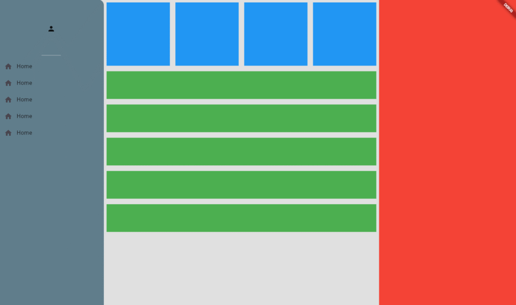
TabletScaffold
Tablet often has more horizontal real estate. You used aspectRatio: 4 and crossAxisCount: 4 — that makes a horizontal strip with 4 tiles in a row.
// lib/scaffolds/tablet_scaffold.dart
import 'package:flutter/material.dart';
import '../constants.dart';
import '../utils/my_box.dart';
import '../utils/my_tile.dart';

class TabletScaffold extends StatelessWidget {
  const TabletScaffold({super.key});

  @override
  Widget build(BuildContext context) {
    return Scaffold(
      appBar: myAppbar,
      drawer: myDrawer,
      backgroundColor: myDefaultBackground,
      body: Column(
        children: [
          // a wide horizontal strip containing 4 boxes
          AspectRatio(
            aspectRatio: 4, // width:height = 4:1 -> wide bar
            child: SizedBox(
              width: double.infinity,
              child: GridView.builder(
                physics: const NeverScrollableScrollPhysics(),
                itemCount: 4,
                gridDelegate: const SliverGridDelegateWithFixedCrossAxisCount(
                  crossAxisCount: 4, // 4 across in one row
                ),
                itemBuilder: (context, index) => const MyBox(),
              ),
            ),
          ),
          // below: vertical tiles as in mobile
          Expanded(
            child: ListView.builder(
              itemCount: 5,
              itemBuilder: (context, index) => const MyTile(),
            ),
          ),
        ],
      ),
    );
  }
}
Explanation
aspectRatio: 4makes the top area short but wide, appropriate for tablet.crossAxisCount: 4places fourMyBoxwidgets horizontally.
DesktopScaffold
On desktop, you usually have a permanent side navigation and often a 3-column layout. Your desktop layout used a Row with myDrawer as the first child that works, but Drawer is normally used via Scaffold.drawer. For desktop, a custom SideMenu or NavigationRail is better. Still, this layout works as a simple example of implementing responsive design in Flutter.
// lib/scaffolds/desktop_scaffold.dart
import 'package:flutter/material.dart';
import '../constants.dart';
import '../utils/my_box.dart';
import '../utils/my_tile.dart';

class DesktopScaffold extends StatelessWidget {
  const DesktopScaffold({super.key});

  @override
  Widget build(BuildContext context) {
    return Scaffold(
      backgroundColor: myDefaultBackground,
      body: Row(
        children: [
          // left column: permanent drawer/side menu
          SizedBox(width: 250, child: myDrawer), // better to give fixed width

          // middle column: main content
          Expanded(
            flex: 2,
            child: Column(
              children: [
                AspectRatio(
                  aspectRatio: 4,
                  child: SizedBox(
                    width: double.infinity,
                    child: GridView.builder(
                      physics: const NeverScrollableScrollPhysics(),
                      itemCount: 4,
                      gridDelegate:
                          const SliverGridDelegateWithFixedCrossAxisCount(
                        crossAxisCount: 4,
                      ),
                      itemBuilder: (context, index) => const MyBox(),
                    ),
                  ),
                ),
                Expanded(
                  child: ListView.builder(
                    itemCount: 5,
                    itemBuilder: (context, index) => const MyTile(),
                  ),
                ),
              ],
            ),
          ),

          // right column: details / extra panel
          Expanded(
            flex: 1,
            child: Column(
              children: const [
                Expanded(child: SizedBox()), // placeholder
              ],
            ),
          ),
        ],
      ),
    );
  }
}
Notes
- Use
SizedBox(width: 250, child: myDrawer)so the side menu keeps a stable width. - On desktop you may want
NavigationRailor a customContainerinstead of aDrawerwidget —Draweris meant to slide out, while desktop nav is usually permanent.
Utilities: MyBox & MyTile (small reusable widgets)
These are your small UI tiles. You made them simple containers — good for demo.
// lib/utils/my_box.dart
import 'package:flutter/material.dart';

class MyBox extends StatelessWidget {
  const MyBox({super.key});

  @override
  Widget build(BuildContext context) {
    return const Padding(
      padding: EdgeInsets.all(8.0),
      child: DecoratedBox(
        decoration: BoxDecoration(color: Colors.blue),
      ),
    );
  }
}
// lib/utils/my_tile.dart
import 'package:flutter/material.dart';

class MyTile extends StatelessWidget {
  const MyTile({super.key});

  @override
  Widget build(BuildContext context) {
    return const Padding(
      padding: EdgeInsets.all(8.0),
      child: SizedBox(
        height: 80,
        child: DecoratedBox(
          decoration: BoxDecoration(color: Colors.green),
        ),
      ),
    );
  }
}
The Main.dart put it all together to make responsive design in Flutter
// lib/main.dart
import 'package:flutter/material.dart';
import 'responsive_layout.dart';
import 'scaffolds/mobile_scaffold.dart';
import 'scaffolds/tablet_scaffold.dart';
import 'scaffolds/desktop_scaffold.dart';

void main() {
  runApp(const MyApp());
}

class MyApp extends StatelessWidget {
  const MyApp({super.key});
  @override
  Widget build(BuildContext context) {
    return MaterialApp(
      title: 'Responsive Flutter Demo',
      debugShowCheckedModeBanner: false,
      theme: ThemeData(
        primarySwatch: Colors.blueGrey,
      ),
      home: const ResponsiveLayout(
        mobileScaffold: MobileScaffold(),
        tabletScaffold: TabletScaffold(),
        desktopScaffold: DesktopScaffold(),
      ),
    );
  }
}
Why your original layout works.
LayoutBuilderchecksconstraints.maxWidthand returns appropriate scaffold.AspectRatiokeeps top grid area proportional.GridView.buildercreates N boxes withcrossAxisCounttuned to device size.Expanded+ListView.builderfills remaining vertical space for scrollable lists.
Practical improvements & tips
- Use StatelessWidget unless you need state. Your scaffold widgets can be
StatelessWidget(they don’t usesetState). - Use
consteverywhere you can (const MyBox(),const MyTile()). This reduces rebuild cost. - Move breakpoints to constants so you can tweak them centrally.
- Use
childAspectRatioinSliverGridDelegateWithFixedCrossAxisCountinstead of relying onAspectRatioif you want finer control of each grid cell’s shape:
gridDelegate: SliverGridDelegateWithFixedCrossAxisCount(
  crossAxisCount: 4,
  childAspectRatio: 1.0, // width / height for each tile
),
Conclusion
Creating a responsive design in Flutter is both simple and powerful when you use the right tools. By leveraging LayoutBuilder, you can easily detect screen width and show different layouts for mobile, tablet, and desktop. Using GridView, AspectRatio, and Expanded ensures your UI elements scale gracefully across devices. Read More Articles
Key takeaways:
- Keep your UI modular: separate scaffolds for mobile, tablet, and desktop to achieve responsive design in Flutter.
- Use constants for breakpoints to maintain flexibility.
- Apply reusable widgets (
MyBox,MyTile) for cleaner code. - Test on multiple screen sizes to ensure the layout remains consistent and user-friendly by implementing responsive design in Flutter.
With these practices, your Flutter apps will look polished and professional on any device, improving user experience and engagement through responsive design in Flutter.
- How to Add a Shimmer Effect in Flutter Apps Using the Skeletonizer Package
- How to Create a Bottom Navigation Bar in Flutter (Complete 2025 Guide)
- How to Create an AppBar in Flutter in 2025 (Complete Guide)
- How to Add Localization in Flutter Apps 2025 Using GetX
- How to Use Packages in Flutter Apps in 2025 – Complete Guide